

MakeMyTrip
MakeMyTrip
MakeMyTrip
Booking hotels with confidence
Booking hotels with confidence
Booking hotels with confidence
OVERVIEW
Make My Trip is one of the most popular hotel and flight booking providers in India, with millions of monthly users. They approached us to improve the Hotel, Flight and Payment sessions. I worked in the Hotels section.
OVERVIEW
Make My Trip is one of the most popular hotel and flight booking providers in India. Their service is used by tens of millions of users in India. They approached us to improve the Hotel, Flight and Payment sessions. I worked on the Hotels session.
ABOUT
Android App, Spring 2015
ROLE
User Interface, User Experience, Product Strategy
TEAM
Design - Guilherme Schmitt, Aaron Tenbuuren, Akhil Dakinedi, Alice Chuang
Project Management - Tong Yu, Anuja Shah, Matt Bridges, JR Surprenant, Dennis Bachman
THE PROBLEM
THE PROBLEM
Booking on the Move
Booking on the Move
Booking on the Move
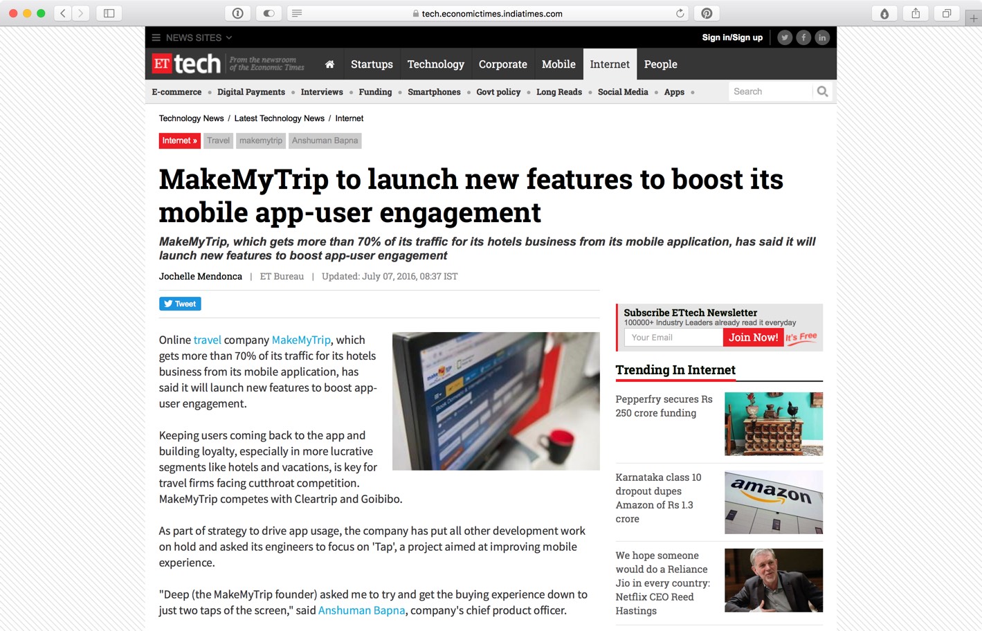
As a significant segment of the population in India was getting online for the first time through mobile devices, MakeMyTrip chose to invest strategically in their mobile offerings, assigning to us the goal of redoing their Hotels and Flights experience catered to the unique characteristics of the Indian market.
As a big segment of the population in India was getting online for the first time through mobile devices, MakeMyTrip chose to invest strategically in their mobile offerings, approaching us with the goal of redoing their Hotels and Flights experience catered to the unique characteristics of the indian market.
As a big segment of the population in India was getting online for the first time through mobile devices, MakeMyTrip chose to invest strategically in their mobile offerings, approaching us with the goal of redoing their Hotels and Flights experience catered to the unique characteristics of the indian market.
As a big segment of the population in India was getting online for the first time through mobile devices, MakeMyTrip chose to invest strategically in their mobile offerings, approaching us with the goal of redoing their Hotels and Flights experience catered to the unique characteristics of the indian market.
IN HIERARCHY
Desktop Thinking
MakeMyTrip mobile apps originally attempted to replicate all the features and functionalities of their desktop site, resulting in a cluttered experience. Additionally, their Android app wasn't updated to adhere to Material Design Guidelines, being perceived as dated and antiquated.
MakeMyTrip mobile apps originally attempted to replicate all the features and functionalities of their desktop site, resulting in a cluttered experience. Additionally, their Android app wasn't updated to adhere to Material Design Guidelines, being perceived as dated and antiquated.
MakeMyTrip mobile apps originally attempted to replicate all the features and functionalities of their desktop site, resulting in a cluttered experience. Additionally, their Android app wasn't updated to adhere to Material Design Guidelines, being perceived as dated and antiquated.
MakeMyTrip mobile apps originally attempted to replicate all the features and functionalities of their desktop site, resulting in a cluttered experience. Additionally, their Android app wasn't updated to adhere to Material Design Guidelines, being perceived as dated and antiquated.
IN PAYMENTS
Purchase Reassurance
Purchase Reassurance
Being a more price-sensitive audience, a big emphasis of the product was to be transparent to users about the progress of the purchase flow and to clearly communicate the details of the deal - giving users the guarantee that all the details for their trip will be taken care of.
Being a more price-sensitive audience, a big emphasis of the product was to be transparent to users about the progress of the purchase flow and to clarly communicate the details of the deal - giving users the guarantee that all the details for their trip will be taken care of.
Being a more price-sensitive audience, a big emphasis of the product was to be transparent to users about the progress of the purchase flow and to clarly communicate the details of the deal - giving users the guarantee that all the details for their trip will be taken care of.
Being a more price-sensitive audience, a big emphasis of the product was to be transparent to users about the progress of the purchase flow and to clearly communicate the details of the deal - giving users the guarantee that all the details for their trip will be taken care of.
How might we...
How might we...
How might we...
How might we...
How might we...
streamline the hotels booking system, addressing the needs of the Indian market while establishing trust and reliability in mobile payments?
streamline the hotels booking system, addressing the needs of the Indian market while establishing trust and reliability in mobile payments?
streamline the hotels booking system, addressing the needs of the Indian market while establishing trust and reliability in mobile payments?
streamline the hotels booking system, addressing the needs of the Indian market while establishing trust and reliability in mobile payments?
streamline the hotels booking system, addressing the needs of the Indian market while establishing trust and reliability in mobile payments?
Process
Process
Process
Understanding the Market
Understanding the Market
Understanding the Market
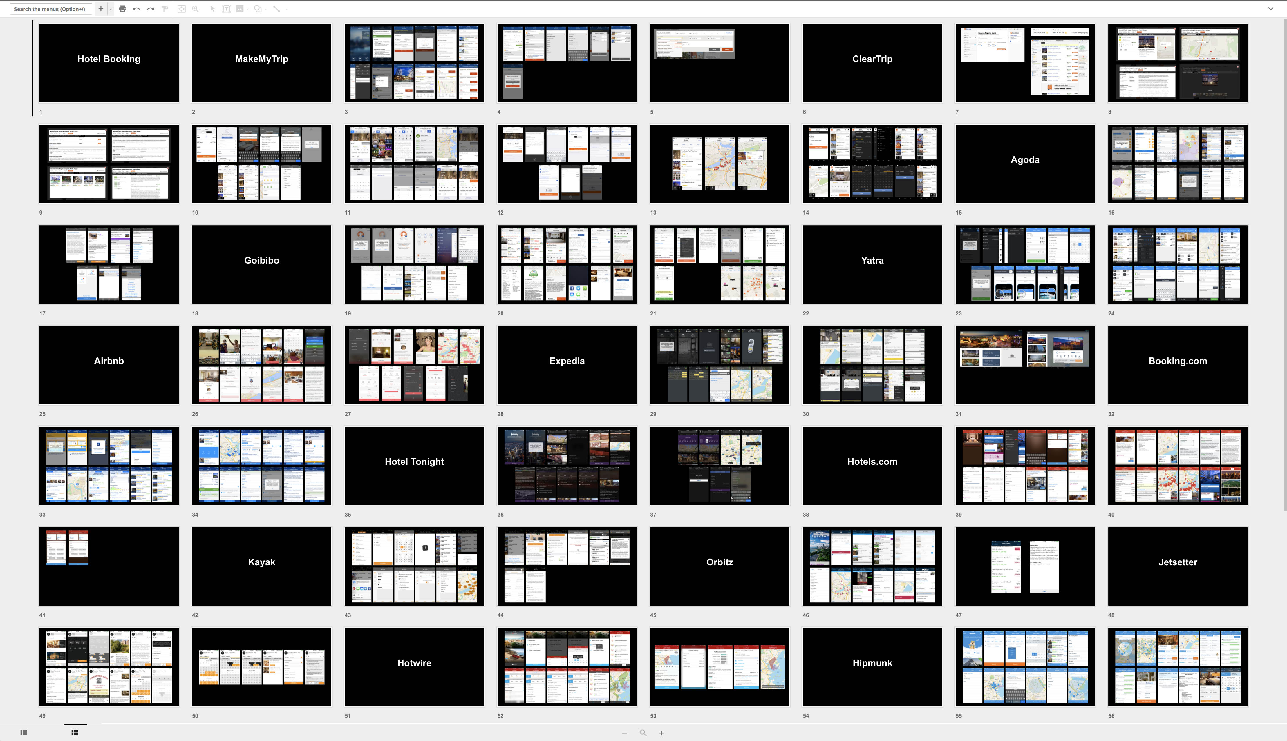
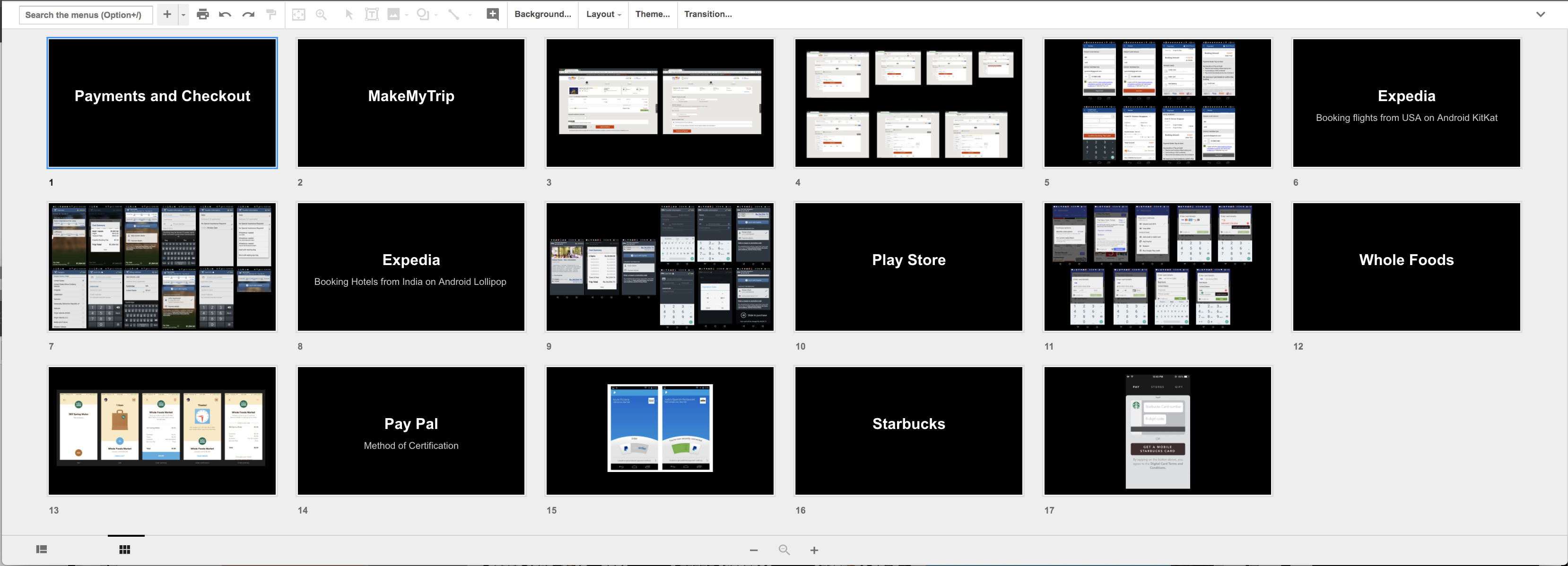
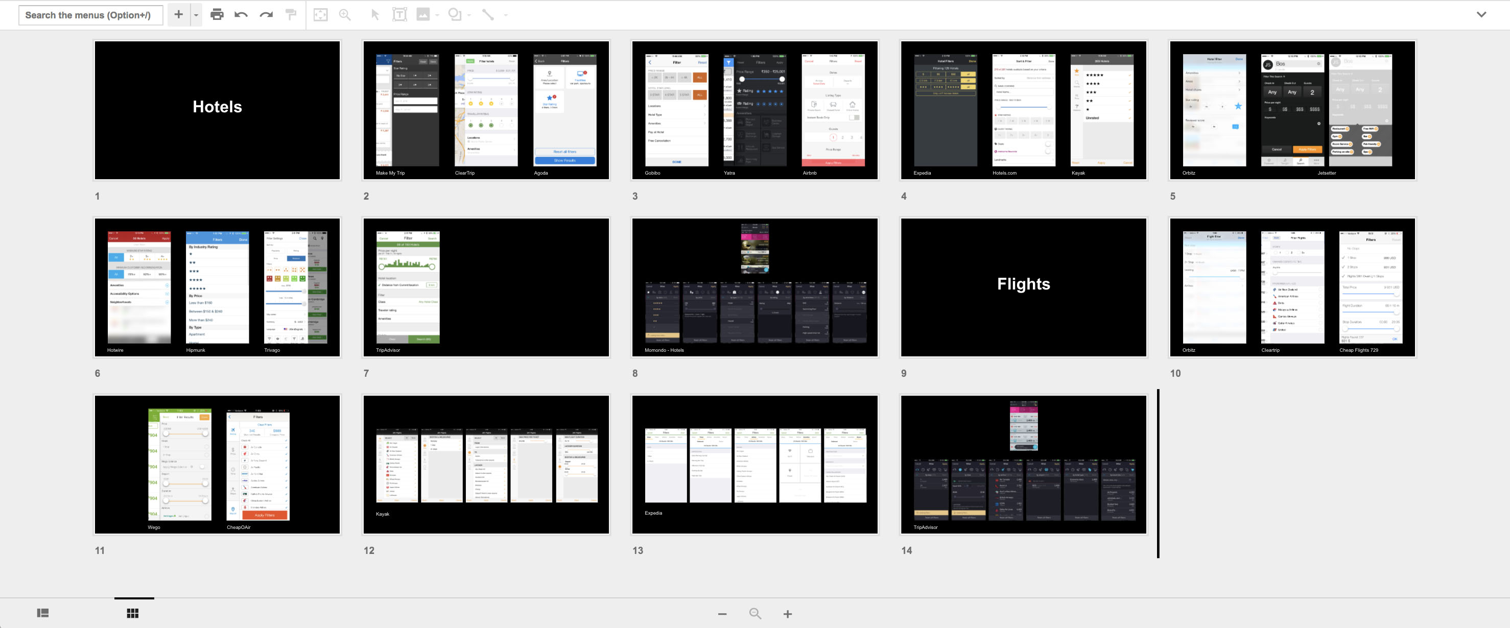
I worked closely with the MakeMyTrip team to build a product that would be aligned with the preferences of the Indian market. Through a deep dive of competitor analysis and research interaction, we identified the need for building an experience that would degrade gracefully, supporting both high-end and low-end Android devices.
We worked closely with the MakeMyTrip team to build a product that would be aligned with the preferences of the Indian market. Through a deep dive of competitor analysis and research interaction we identified the need of building an experience that would degrade gracefully, supporting both high-end and low-end Android devices.
We worked closely with the MakeMyTrip team to build a product that would be aligned with the preferences of the Indian market. Through a deep dive of competitor analysis and research interaction we identified the need of building an experience that would degrade gracefully, supporting both high-end and low-end Android devices.
We worked closely with the MakeMyTrip team to build a product that would be aligned with the preferences of the Indian market. Through a deep dive of competitor analysis and research interaction we identified the need of building an experience that would degrade gracefully, supporting both high-end and low-end Android devices.
Sketches
Sketches
Sketches
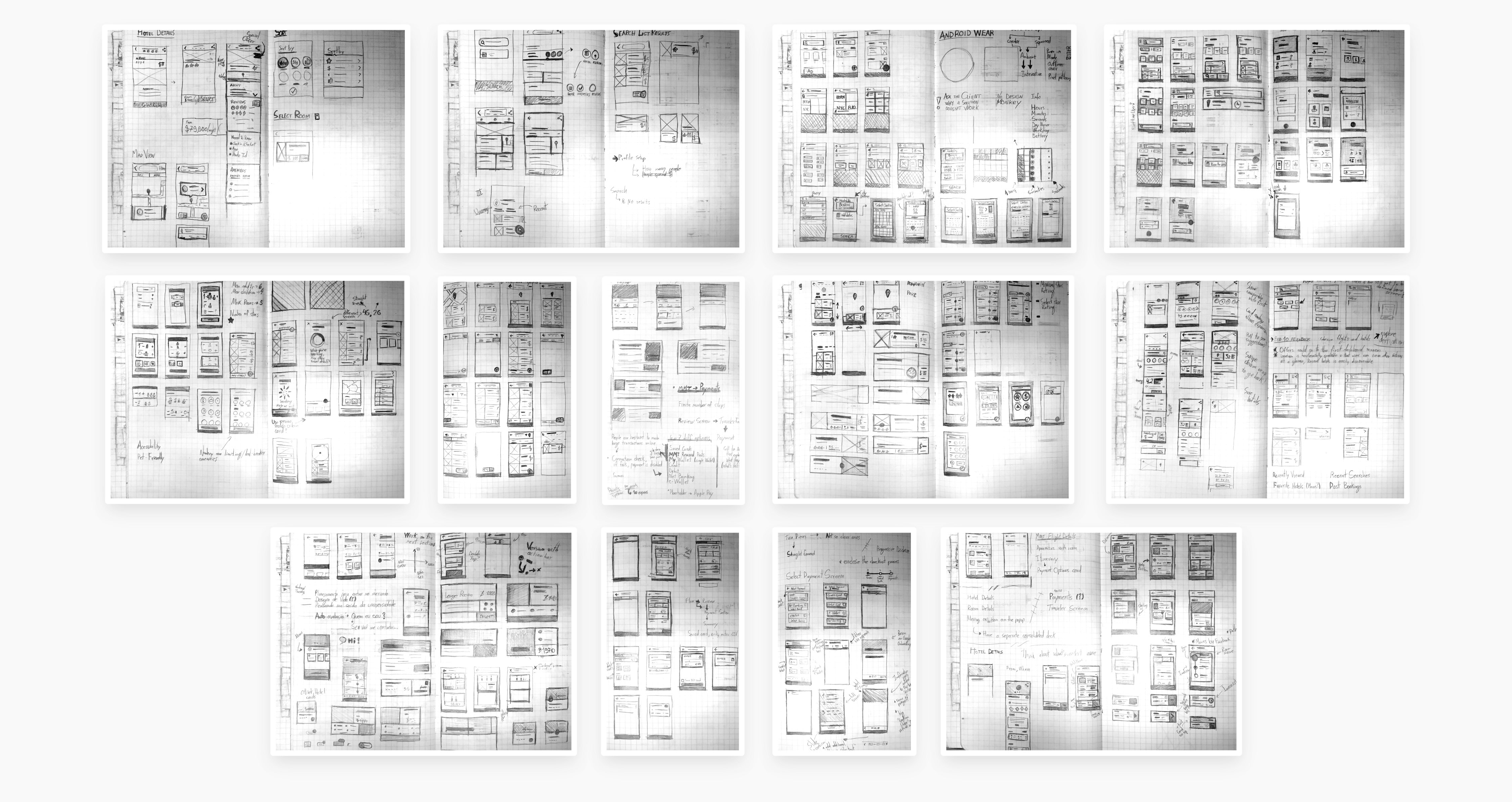
The iteration process focused on finding ways to simplify the experience while still providing the information users need to perform their purchase. Through an initial set of sketches, I explored early ideas of layout, borrowing from Material Design card components to distinguish information from distinct sources.
The iteration process was focused on finding ways to simplify the experience while still providing the information users need to perform their purchase. Thorugh an initial set of sketches, early ideas of layout were explored, borrowing from Material Design card components to distinguish information from distinct sources.
The iteration process was focused on finding ways to simplify the experience while still providing the information users need to perform their purchase. Thorugh an initial set of sketches, early ideas of layout were explored, borrowing from Material Design card components to distinguish information from distinct sources.
The iteration process was focused on finding ways to simplify the experience while still providing the information users need to perform their purchase. Thorugh an initial set of sketches, early ideas of layout were explored, borrowing from Material Design card components to distinguish information from distinct sources.
Wireframes
Wireframes
Wireframes
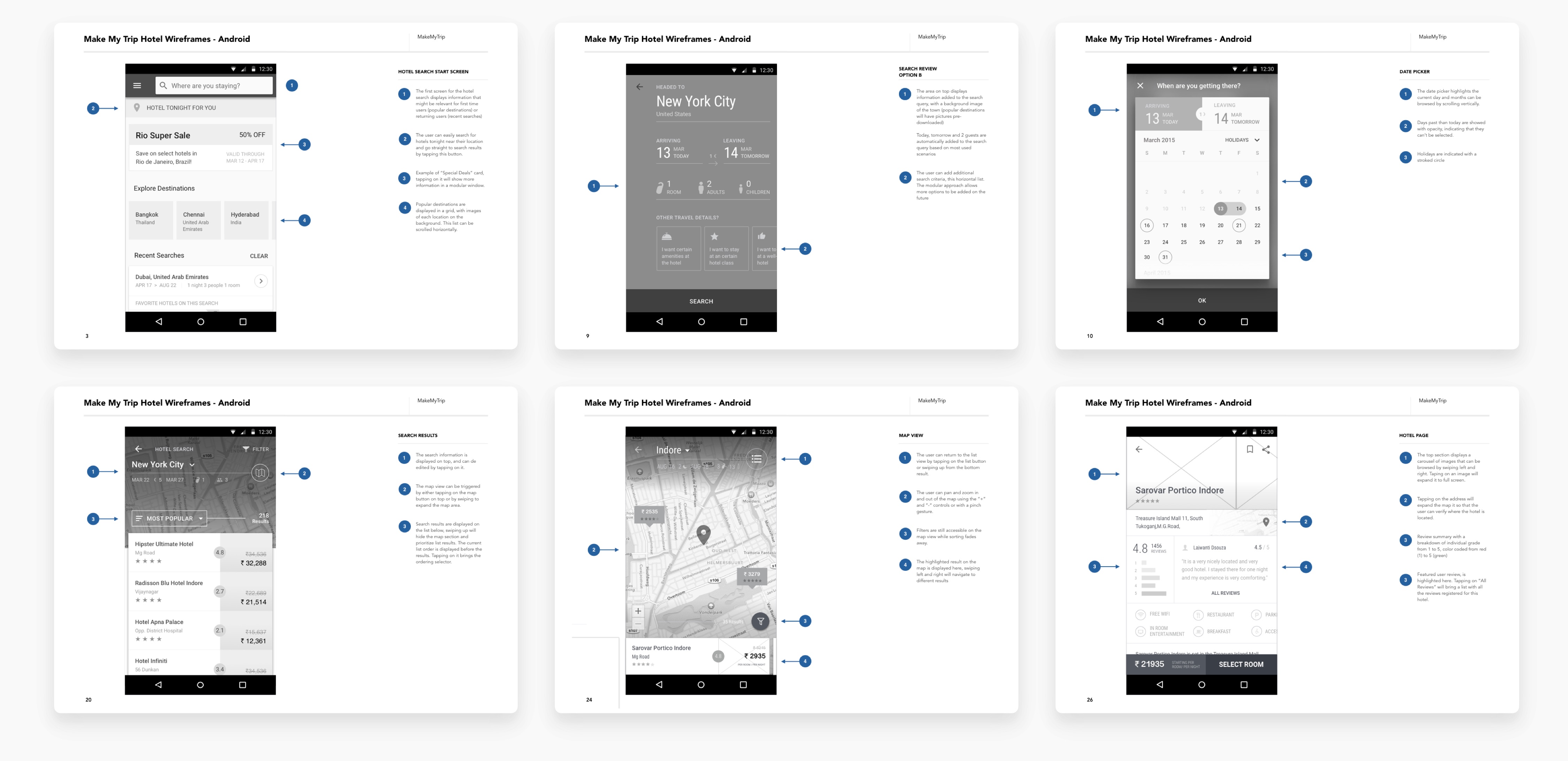
From paper to digital, I explored a hybrid Hotel result screen, combining the geographical exploration of a map view with the direct comparison capabilities of a list view. Users could swipe down to go into the map mode or just swipe up to see all the results, adding filters based on rating, price and popular amenities.
From paper to digital, I explored a hybrid Hotel result screen, combining the geographical exploration of a map view with the direct comparison capabilities of a list view. Users could swipe down to go into the map mode or just swipe down to see all the results, adding filters based on rating, price and popular amenities.
From paper to digital, I explored a hybrid Hotel result screen, combining the geographical exploration of a map view with the direct comparison capabilities of a list view. Users could swipe down to go into the map mode or just swipe down to see all the results, adding filters based on rating, price and popular amenities.
From paper to digital, I explored a hybrid Hotel result screen, combining the geographical exploration of a map view with the direct comparison capabilities of a list view. Users could swipe down to go into the map mode or just swipe down to see all the results, adding filters based on rating, price and popular amenities.
Product Strategy
Product Strategy
Product Strategy
The product strategy focused on finding opportunities to proactively ask for and provide data that would be useful for users to either make their purchase decision or narrow down the list of results to something that users would be interested in.
The product strategy was focused on finding opportunities to proactively ask for and provide data that would be useful for users to either make their purchase decision or narrow down the list of results to something that users would be interested in.
The product strategy was focused on finding opportunities to proactively ask for and provide data that would be useful for users to either make their purchase decision or narrow down the list of results to something that users would be interested in.
The product strategy was focused on finding opportunities to proactively ask for and provide data that would be useful for users to either make their purchase decision or narrow down the list of results to something that users would be interested in.
Helpful Suggestions
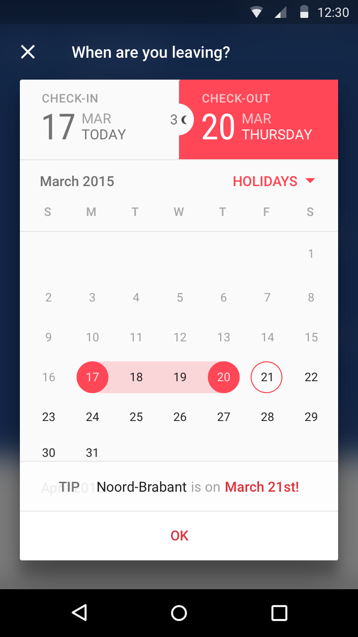
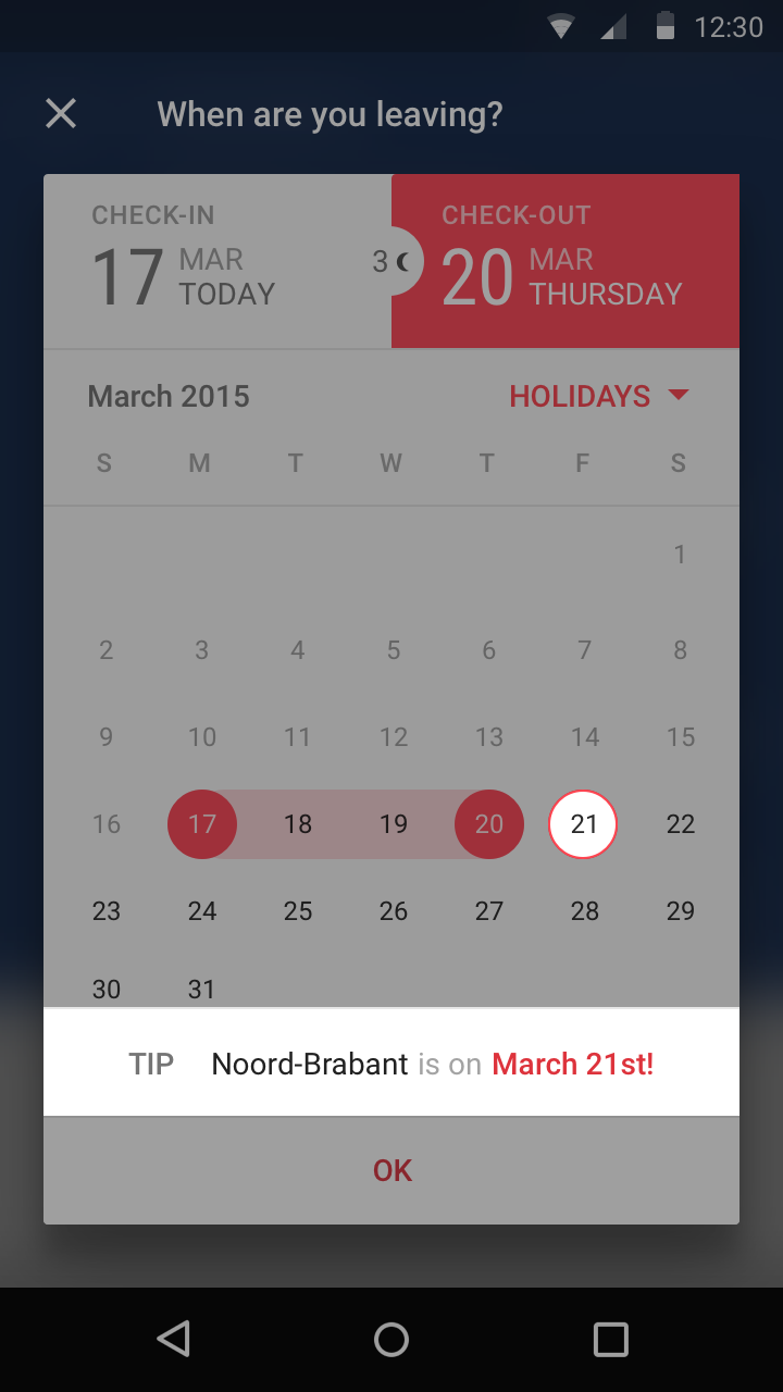
A lot of trips from MakeMyTrip users happen around national Indian holidays. When users book on dates that are close to popular holidays, the app suggests an extension to their stay.
A lot of trips from MakeMyTrip users happen around national Indian holidays. When users book on dates that are close to popular holidays, the app suggests an extension to their stay.
A lot of trips from MakeMyTrip users happen around national Indian holidays. When users book on dates that are close to popular holidays, the app suggests an extension to their stay.
Location Tips
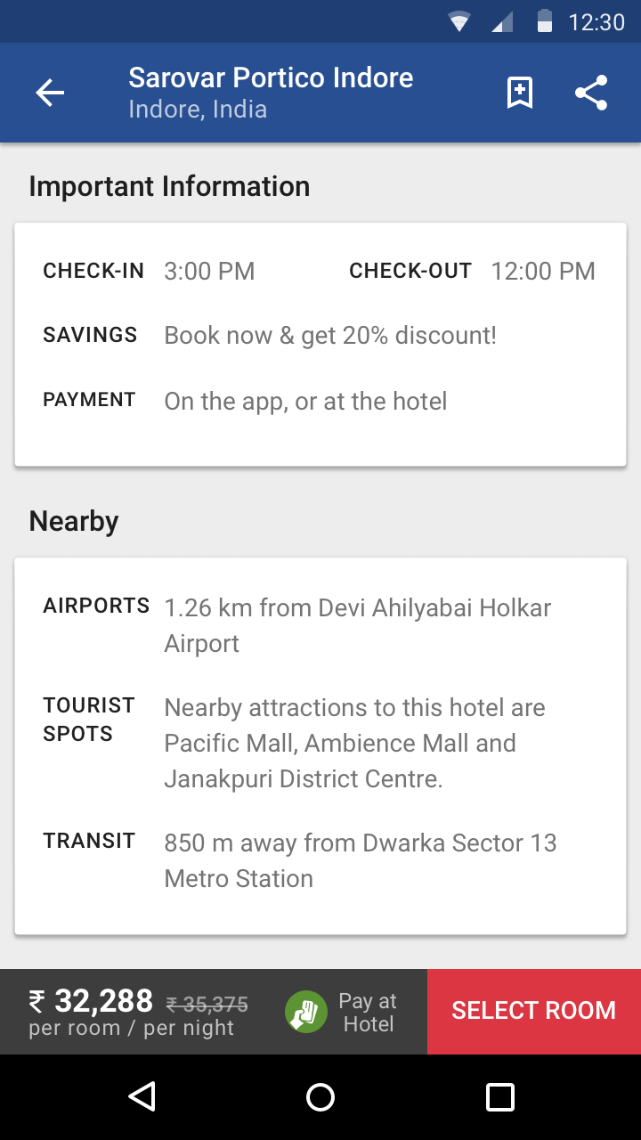
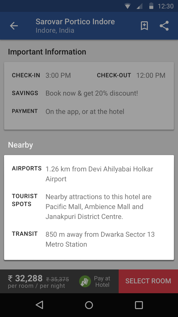
On hotel listings, a "Nearby" card shows relevant information about the location of the Hotel and its proximity to points of interest such as tourist spots and transit options.
On hotel listings, a "Nearby" card shows relevant information about the location of the Hotel and its proximity to points of interest such as tourist spots and transit options.
On hotel listings, a "Nearby" card shows relevant information about the location of the Hotel and its proximity to points of interest such as tourist spots and transit options.
Contextual Reviews
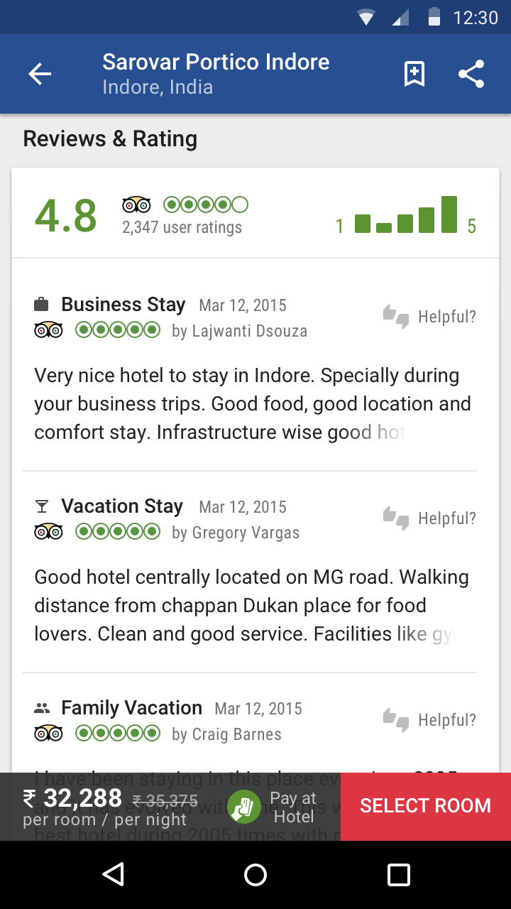
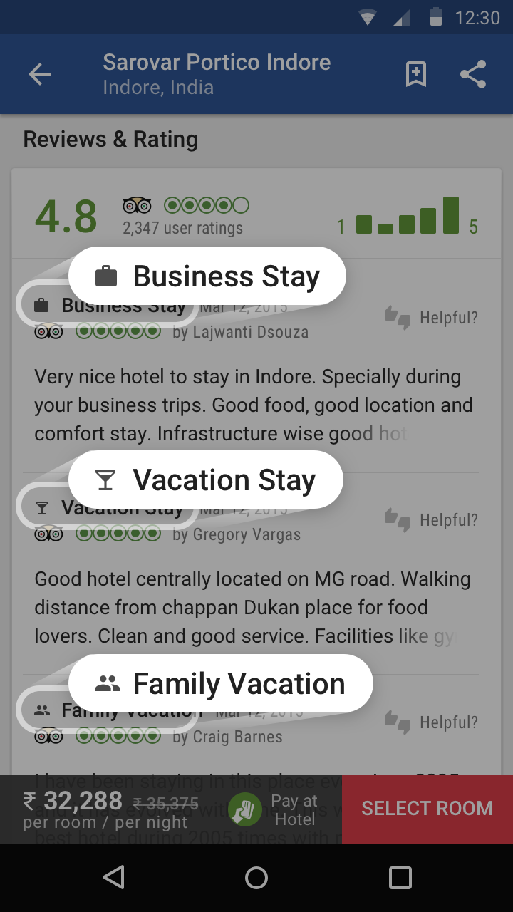
Not all trips are the same. To be useful, hotel reviews shouldn't be seen by the same lens either. Reviews (sourced from TripAdvisor) are categorized by type of trip - Business, Vacation or Family, so users can be better informed if the current option suits their needs.
Not all trips are the same. To be useful, hotel reviews shouldn't be seen by the same lens either. Reviews (sourced from TripAdvisor) are categorized by type of trip - Business, Vacation or Family, so users can be better informed if the current option suits their needs.
Not all trips are the same. To be useful, hotel reviews shouldn't be seen by the same lens either. Reviews (sourced from TripAdvisor) are categorized by type of trip - Business, Vacation or Family, so users can be better informed if the current option suits their needs.
Solution
Effortless Planning
Effortless Planning
Effortless Planning
Effortless Planning
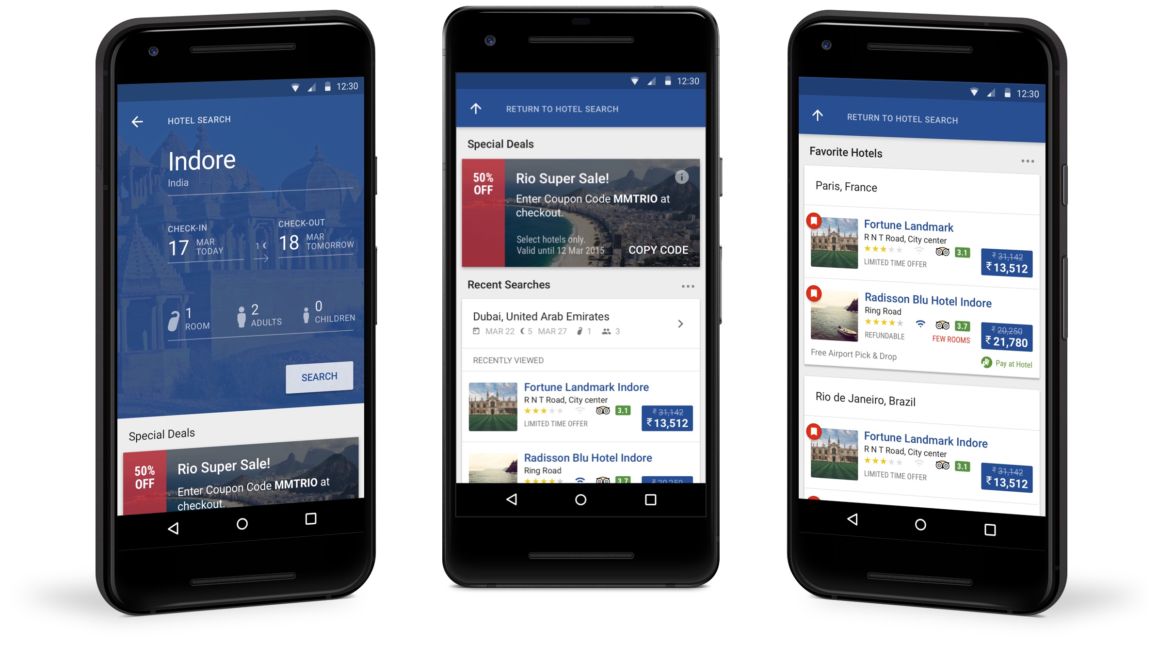
The first screen of the Hotels section allows users to quickly perform a search, get deals on popular destinations or, for returning users, resume previous searches (including jumping straight to previously seen hotels) or booking again from your favorite locations.
The first screen of the Hotels section allows users to quickly perform a search, get deals on popualr destinations or, for returning users, resume previous searches (including jumping straight to previously seen hotels) or booking again from your favorite locations.
The first screen of the Hotels section allows users to quickly perform a search, get deals on popualr destinations or, for returning users, resume previous searches (including jumping straight to previously seen hotels) or booking again from your favorite locations.
The first screen of the Hotels section allows users to quickly perform a search, get deals on popualr destinations or, for returning users, resume previous searches (including jumping straight to previously seen hotels) or booking again from your favorite locations.
Exploring Results
Exploring Results
Exploring Results
Exploring Results
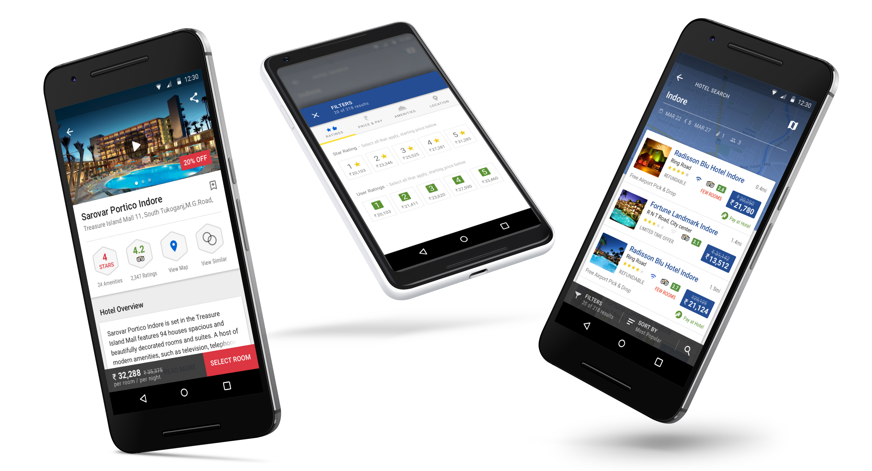
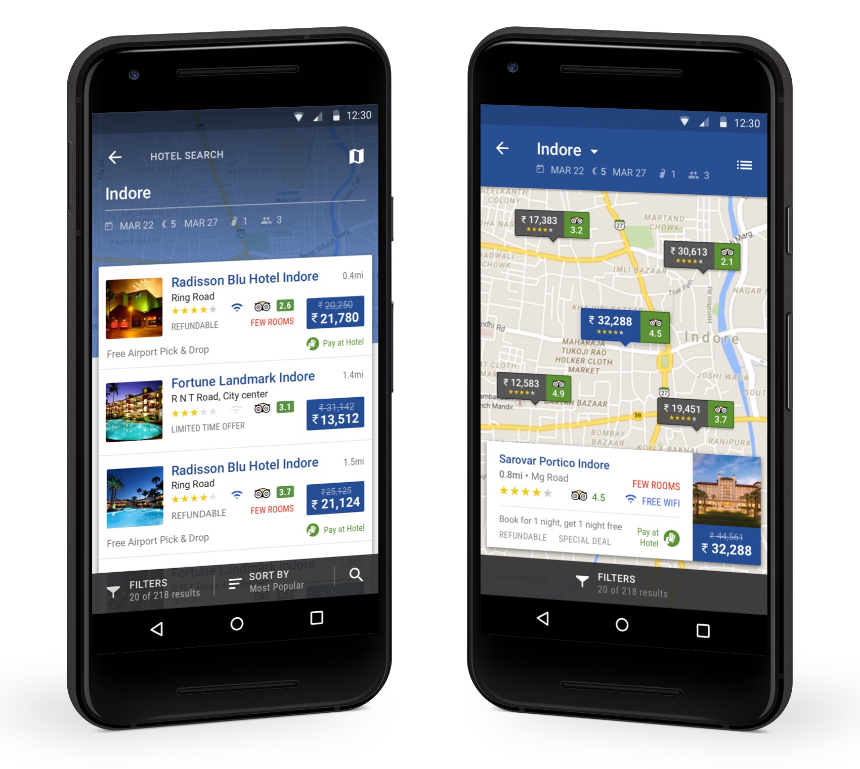
A hybrid results view allows users to quickly swipe up to view the full list of results or swipe down to enter the map mode for geographic exploration.
A hybrid results view allows users to quickly swipe up to view the full list of results or swipe down to enter the map mode for geographic exploration.
A hybrid results view allows users to quickly swipe up to view the full list of results or swipe down to enter the map mode for geographic exploration.
A hybrid results view allows users to quickly swipe up to view the full list of results or swipe down to enter the map mode for geographic exploration.
Narrowing It Down
Narrowing It Down
Narrowing It Down
Narrowing It Down
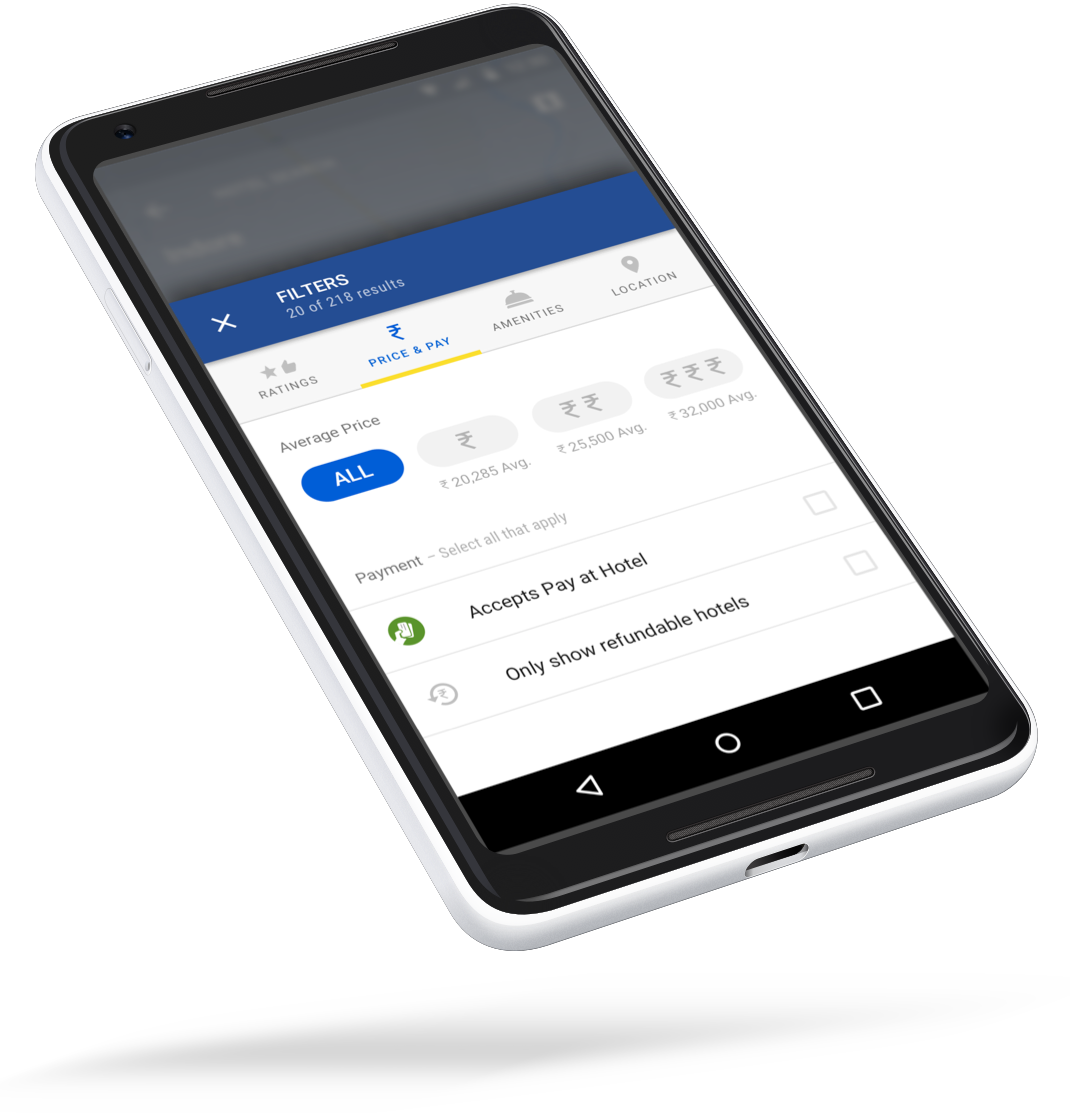
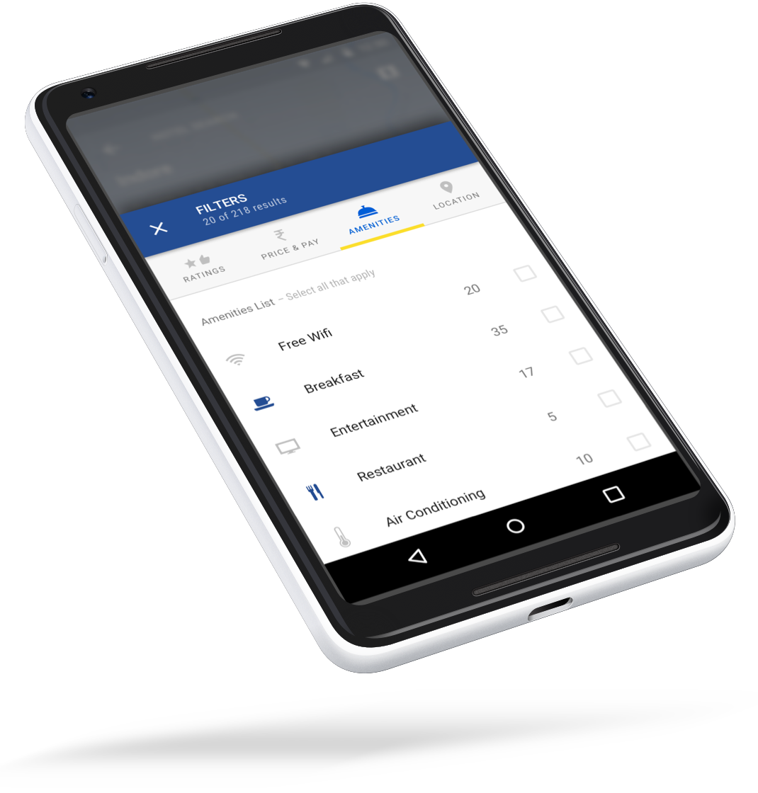
Filters can be applied through a thumb-friendly bottom panel. Users can mix and match options from different categories such as price, location, rating and amenities offered. As users make their selection the result indicator (and available options) get updated in real time, avoiding frustrations with empty results.
Filters can be applied in a thumb-friendly bottom panel. Users can mix and match filters from different categories such as price, location, rating and amenities offereded. As users make their selection the result indicator (and available options) get updated in real time, avoiding frustrations with empty results.
Filters can be applied in a thumb-friendly bottom panel. Users can mix and match filters from different categories such as price, location, rating and amenities offereded. As users make their selection the result indicator (and available options) get updated in real time, avoiding frustrations with empty results.
Filters can be applied in a thumb-friendly bottom panel. Users can mix and match filters from different categories such as price, location, rating and amenities offereded. As users make their selection the result indicator (and available options) get updated in real time, avoiding frustrations with empty results.
Hotel Details
Hotel Details
Hotel Details
Hotel Details
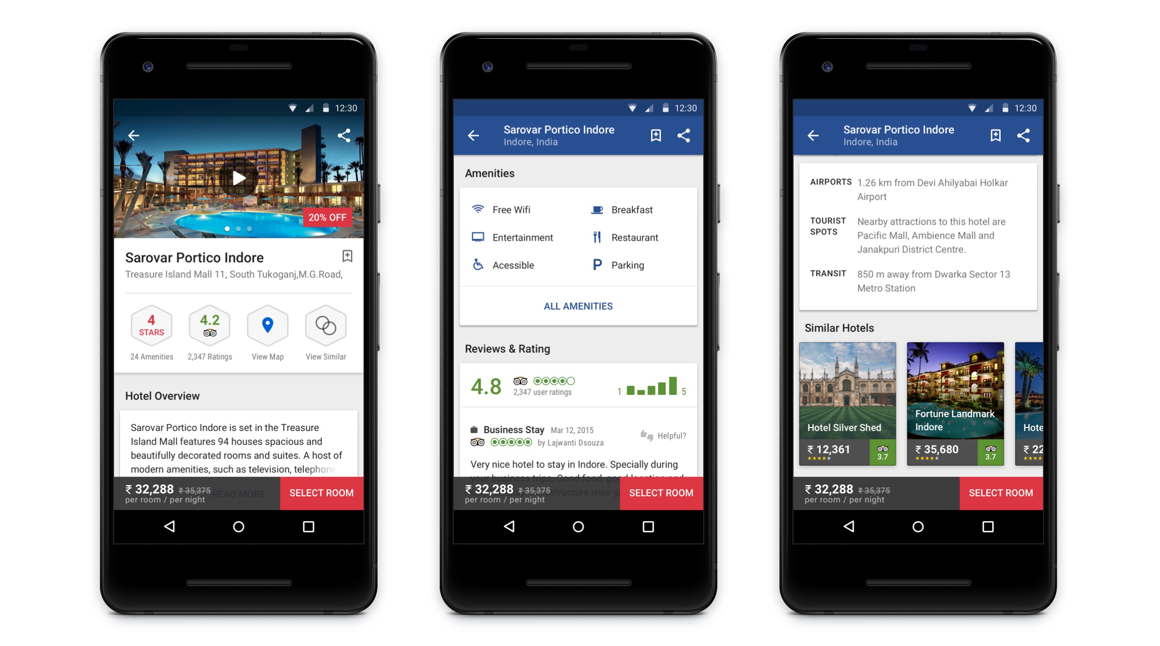
The goal of the Hotel Details page is to present and inform the user about the most important data that they might be interested in. At the top of the screen, a carousel of images and videos allow users to explore their selections visually, while a series of badges give users a quick qualitative summary of their selection (this is crucial for users in a direct comparison mindset).
The goal of the Hotel Details page is to present and inform the user about the most important data that they might be interested in. At the top of the screen, a carossel of images and videos allow users to explore their selections visually, while a series of badges give users a quick qualitative summary of their selection (this is crucial for users in a direct comparison mindset).
The goal of the Hotel Details page is to present and inform the user about the most important data that they might be interested in. At the top of the screen, a carossel of images and videos allow users to explore their selections visually, while a series of badges give users a quick qualitative summary of their selection (this is crucial for users in a direct comparison mindset).
The goal of the Hotel Details page is to present and inform the user about the most important data that they might be interested in. At the top of the screen, a carossel of images and videos allow users to explore their selections visually, while a series of badges give users a quick qualitative summary of their selection (this is crucial for users in a direct comparison mindset).
Mobile Hotel Bookings after App Redesign
Mobile Hotel Bookings after App Redesign
Mobile Hotel Bookings after App Redesign
Up 1,021.9%
in Q4 15
Up 694.8%
in Fiscal Year 2016
links & hobbies
links & hobbies
links & hobbies
links & hobbies
links & hobbies
Photography ∙ Playlists ∙ Films
hey, thanks for visiting
hey, thanks for visiting
hey, thanks for visiting
hey, thanks for visiting
hey, thanks for visiting
have a nice day
have a nice day
have a nice day
have a nice day
have a nice day
PIXELS POLISHED WITH ♥, BY GUI ∙ UPDATED SOMETIME AMIDST THE BLUR OF 2020-21
PIXELS POLISHED WITH ♥, BY GUI ∙ UPDATED UPDATED SOMETIME AMIDST THE BLUR OF 2020
PIXELS POLISHED WITH ♥, BY GUI ∙ UPDATED UPDATED SOMETIME AMIDST THE BLUR OF 2020
PIXELS POLISHED WITH ♥, BY GUI ∙ UPDATED SOMETIME AMIDST THE BLUR OF 2020
PIXELS POLISHED WITH ♥, BY GUI
UPDATED SOMETIME AMIDST
THE BLUR OF 2020
